LOVE COURAGE STRENGTH Poster
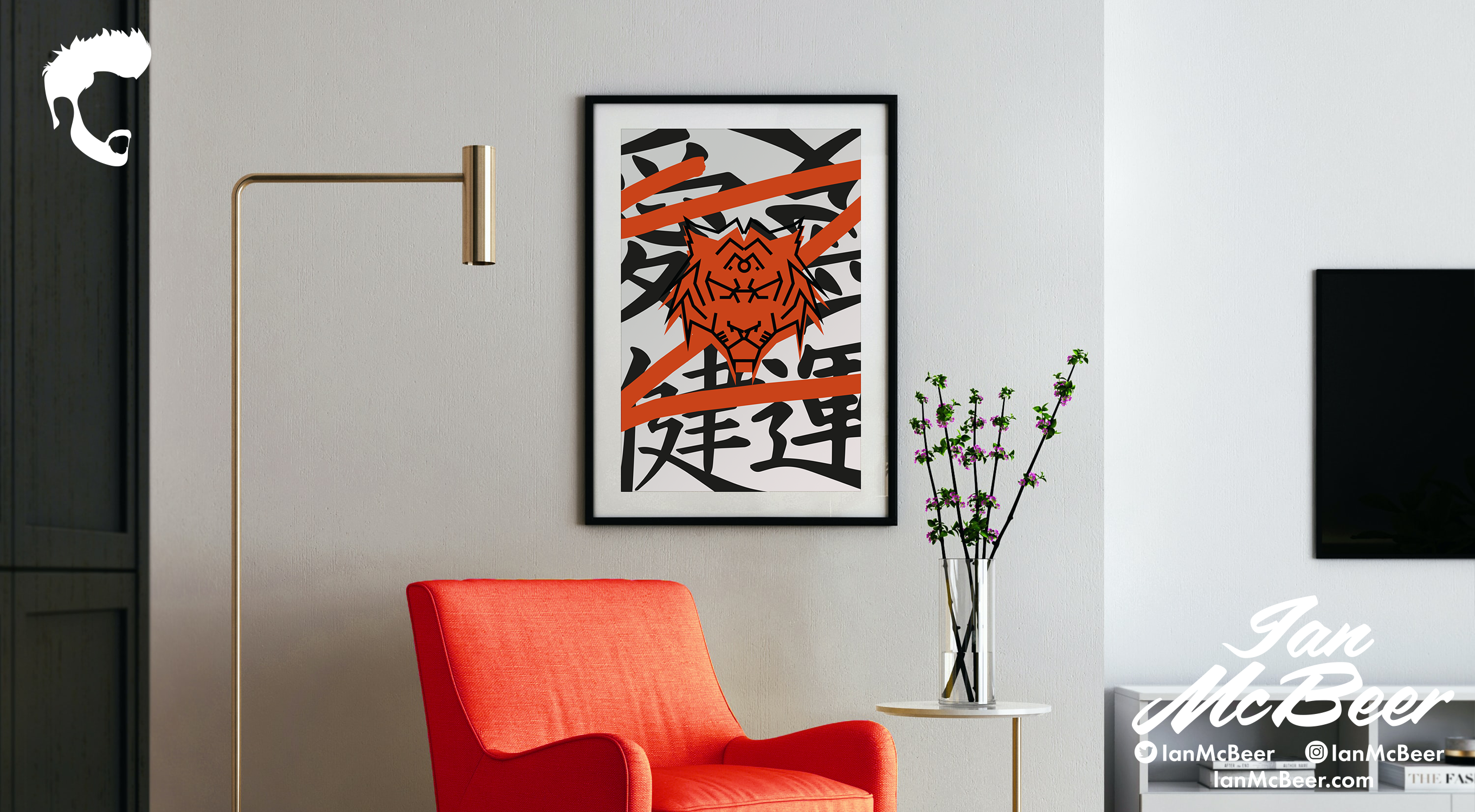
Creating a bold and captivating poster is always a thrilling challenge. Recently, I had the opportunity to work on a project that involved designing a poster featuring a fierce tiger with Japanese kanji text behind it saying ‘Love, Courage, and Strength’.
The first step in creating any design is research. For this project, I delved into the world of Japanese art and calligraphy to gain inspiration. I looked at various styles of Japanese typography, from classic brush strokes to modern fonts, and researched the symbolism of tigers in Japanese culture. This research allowed me to develop a concept for the poster that would accurately represent the theme and convey the intended message.
Once I had a concept in mind, I began sketching out rough ideas for the poster. I experimented with different compositions, layouts, and styles to determine which direction would be most effective. After several iterations, I settled on a bold and dynamic design featuring a large illustration of a tiger in black and red. The Japanese kanji text would be placed behind the tiger, creating a layered effect that added depth and visual interest.
With the basic structure of the poster established, it was time to start refining the details. I began by creating a digital illustration of the tiger using Adobe Illustrator. To achieve the bold and striking look I was aiming for, I used strong lines and bold shapes to create the tiger’s distinctive features. The color palette was limited to black and red, with the black providing a stark contrast against the bright red.
Next, I added the Japanese kanji text to the design. I carefully selected a font that would complement the illustration and convey the desired message. The text was placed behind the tiger, with the red letters overlapping the black stripes of the tiger. This created a sense of depth and movement, adding to the overall visual impact of the poster.
Designing this poster was an exciting and rewarding project. Through research, experimentation, and attention to detail, I was able to create a visually striking design that accurately represented the theme and conveyed the intended message. Projects like these are always a welcome challenge, and I look forward to taking on more in the future.


